Credit to Lu Castro for the cover art of Primal Wizardry and Dear Spellbook
Every cover starts out with a very bad sketch by me to conveu the scale and general layout. With this, I provide a section by section breakdown with some reference art. For this series I am using the same artist who did my Dear Spellbook covers to give the two series some continuity.

Taking my brief, Lu came up with the two sketches below.
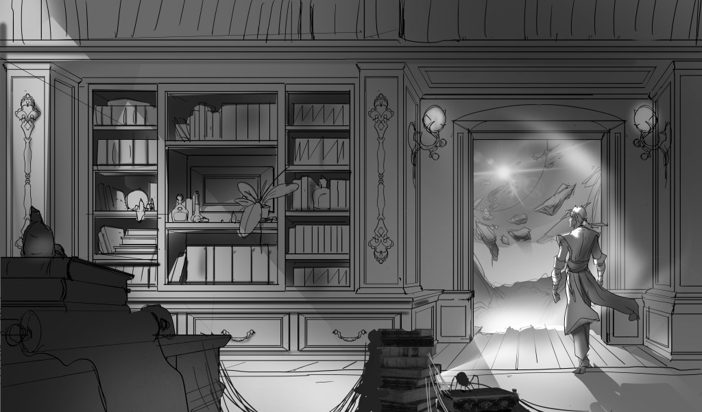
The main feedback I had was that this looked too much like a home library and not a giant magical endless library.
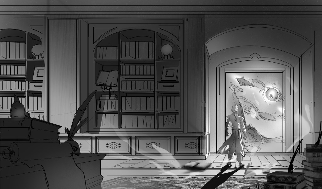
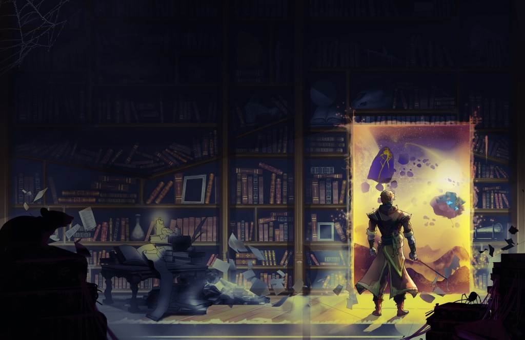
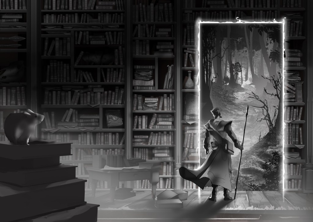
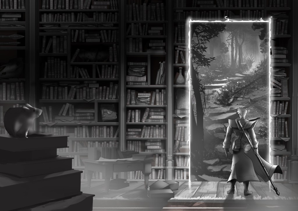
Here is what I got after extensive feedback on the first round. I pointed out which portal I liked better and some other destails. Next I got the color proofs with feedback incorporated and a mix of color and lighting.
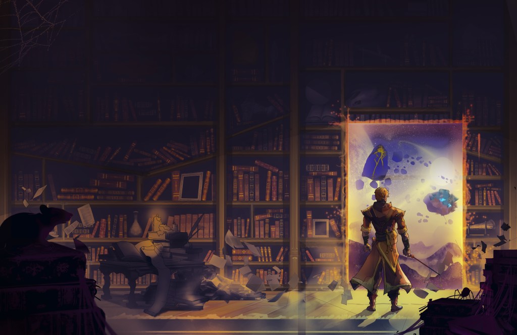
I chose the liting in the first one as my prefered amound and gave more feedback about the light. I asked that the portallyness around the door be removed but the artist suggested I keep it and I followed his advice. It doesn’t match the text description 100% but it looks better.
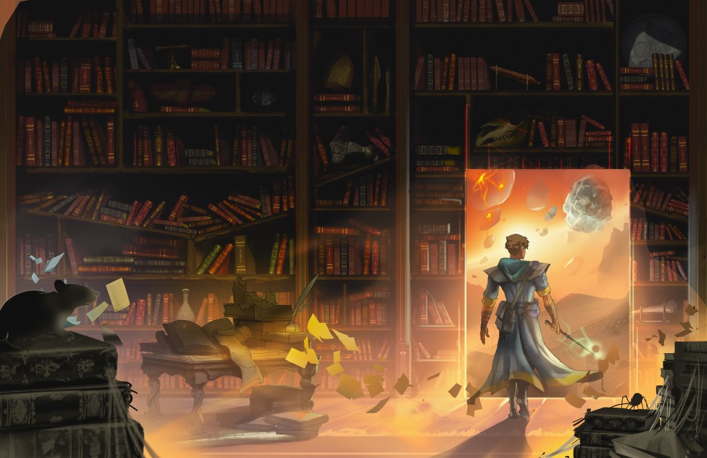
I chose the color for the orange one and the general layout and shape of the blue one.
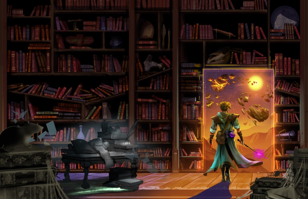
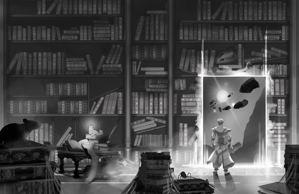
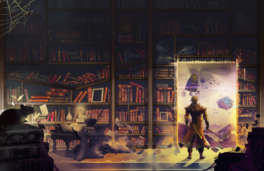
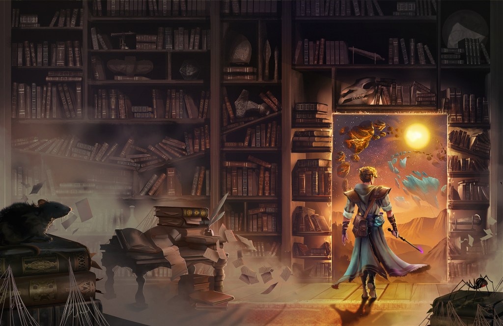
Then came a more rendered version. I wanted the color of the wand less visible, and some back glow to the books around the portal.
The above was my final chance for feedback before the final rendering. I asked that the lighting be updated to make the objects in the door appear further out.
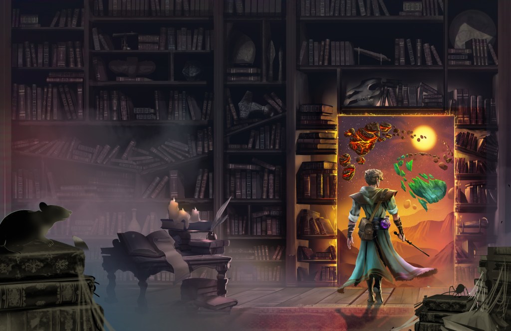
Lastly I asked some candles be removed that I had missed in earlier drafts and that the rocks in front of the sun be gone so they appear to orbit it.
Next we go to typograpthy – PSYCH
I decided to split the 400k words of this series into 3 books, which I had been planning on but abandoned. That means this cover art is not the art for a scene in book 2.
So… Back to Lu for a new book cover.
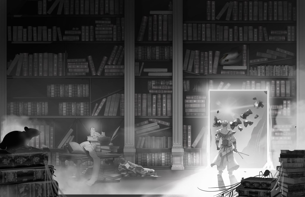
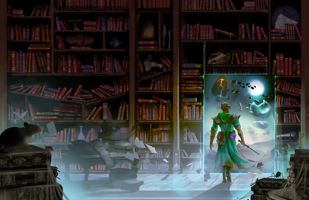
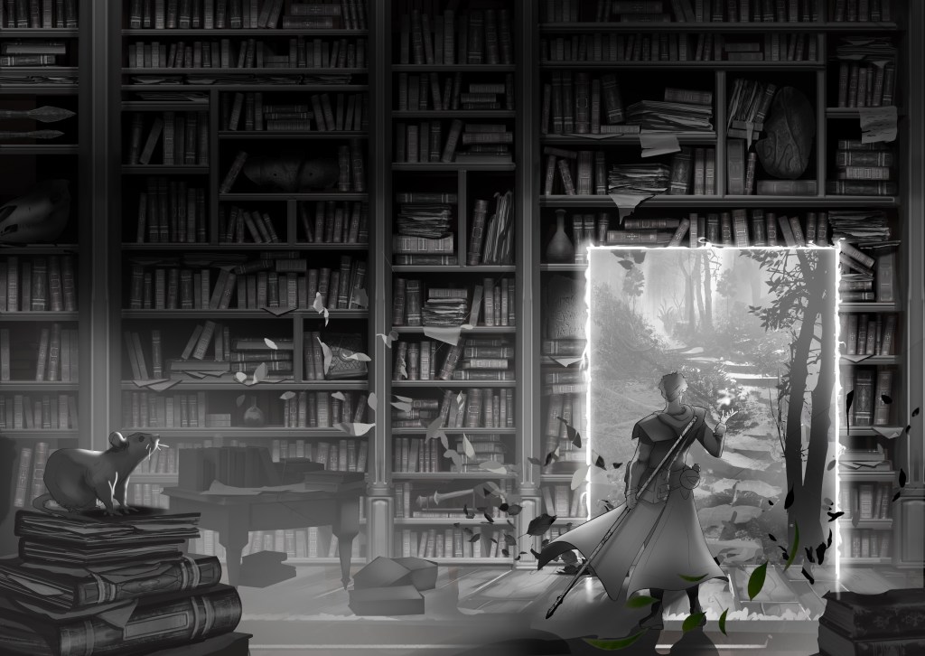
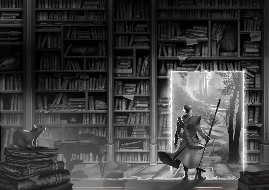
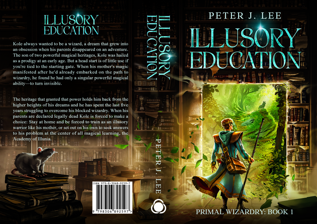
I decided I wanted to have a progression of the libraries distruction from book to book and this library scene proved a good middle ground. I asked that the library be cleaned up, without any broken shelves. I had him clean up some of Kole’s mess and do a new character pose and change the scene through the portal.
I picked some elements from each picture I liked. I asked for some effect to be blowing out of the door like leaves, and that a certain spellbook be less prominently displayed.
There was a miscommunication (by me) as to which pose I wanted to one quick update and I got the final sketch.
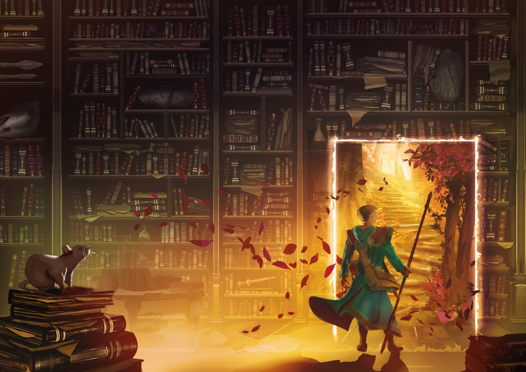
Two color pallet options were given. I picked grean but asked it look more vibrant and less toxic.
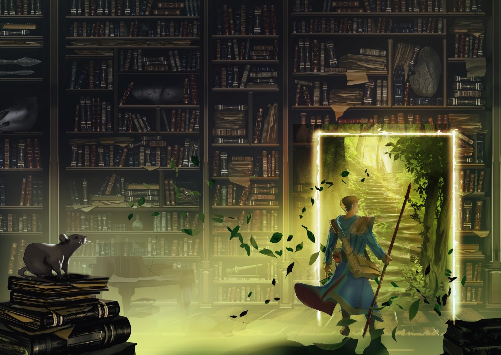
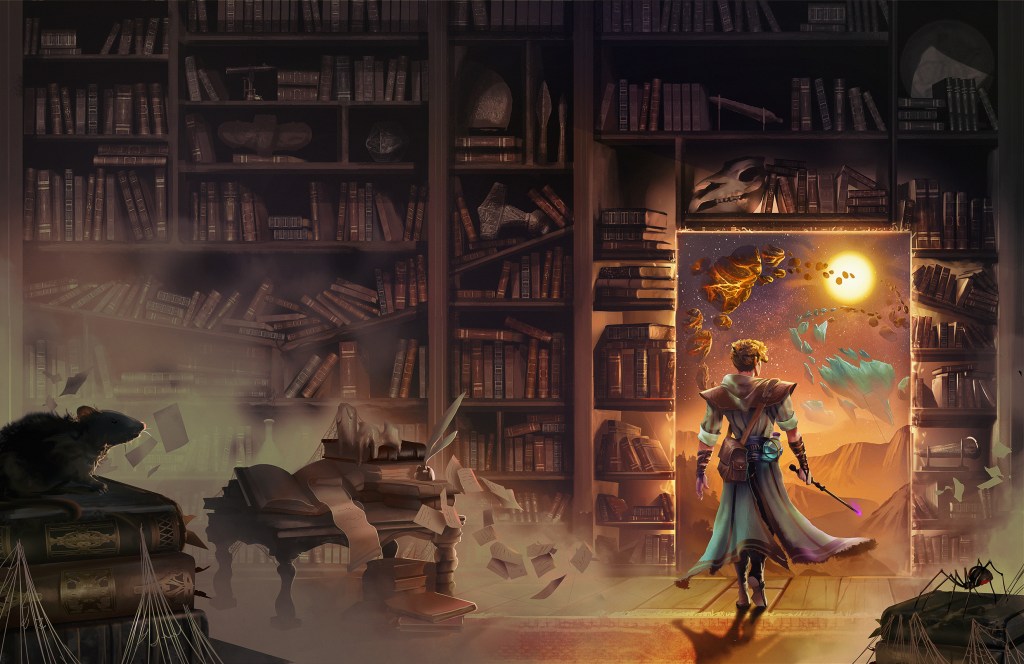
With some final comments and following Lu’s suggestion to add something to the rock inside the doorware, we get the final art.
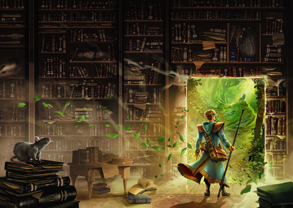
There was a lot of back and forth on the typography, which I won’t show in detail here, but here is the final cover!

Leave a comment