“Don’t judge a book by its cover” is outdated advice (and probably didn’t actually apply to books in its first usage but thats a whole other rant.) Book cover are designed to give reader’s an idea of whats inside and should fit a certain form to signal to readers what to expect. For progression fantasy, it’s generally a picture of the main character locked in battle or standing facing the ‘camera’ showing off their new gear/magic.


Dear Spellbook isn’t exactly action packed from the get go, which made me hesitant to go for the battle scene. My story also doesn’t have a very impressive looking main character in the beginning or the ability for him to progress in appearance across the books, so the second was out as well
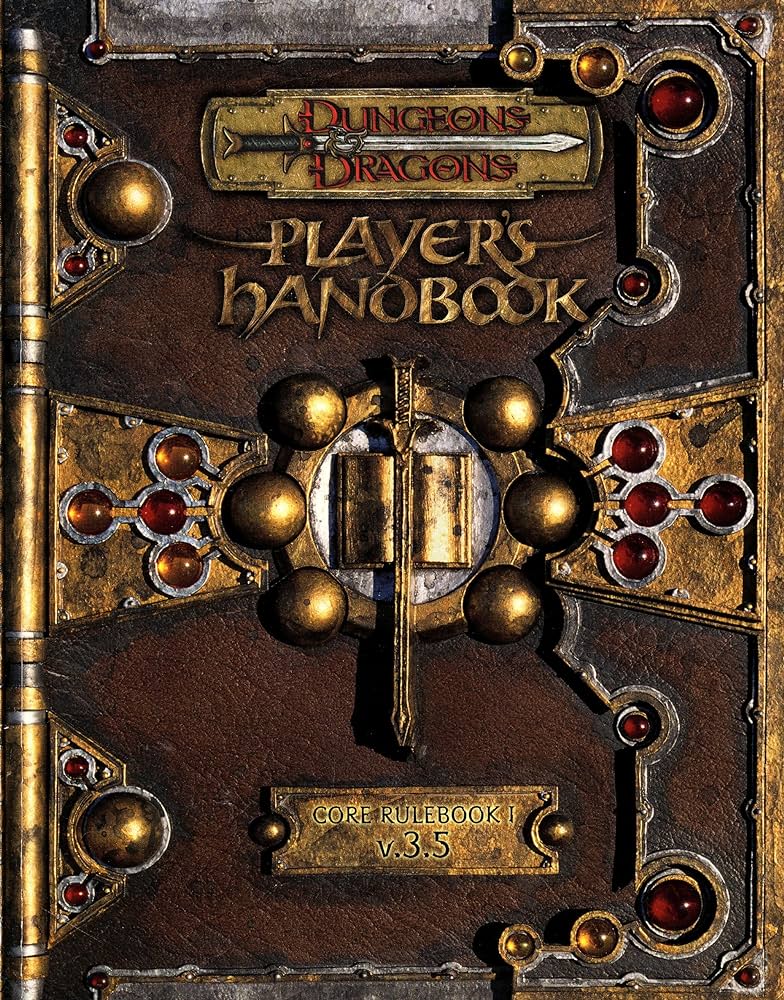
My initial idea for my cover was in hindsight not great. I wanted my book to look like Spellbook in a fashion similar to the D&D 3.5e covers. My publisher advised me against that. But, if I ever do a special edition physical Kickstarter, we’ll probably do this.
I still didn’t want to depict an actual scene from the story, no particular scene captured the feel of the story well and made a good cover. So, I decided instead to make an abstract scene that pulled lots of story elements together.
My next idea was over ambitious. I wanted to have Tal trapped in an hourglass, being attacked by a storm of paper. I wanted the hourglass to be described by the negative space of a broken stained glass window with epic battles between dragons in the glass on the sides. This was inspired by the magic cards below. Imagine the latticework on the left was stained glass, or the center symbol on the Plains was broken glass in an hourglass shape.


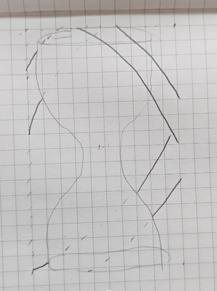
There were a lot of details (and bad sketches) that went along with this idea, but eventually we settled on something simpler. Though the core of this idea stuck around in the end.
Early hourglass ideas (once I got past the stained glass idea) were going to be more abstract. One idea had the hourglass in three nested rings, as a nod to some lore. The other replaced a frame for the hourglass with a coiling dragon.
The hourglass idea stuck as well as the dragons and I sent a brief to the artist Lu Castro.
He came back with these two drafts.
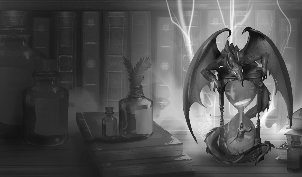
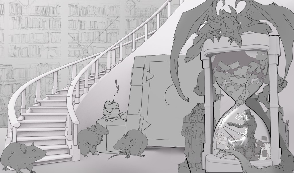
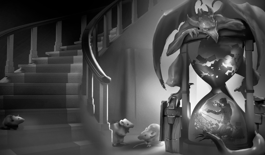
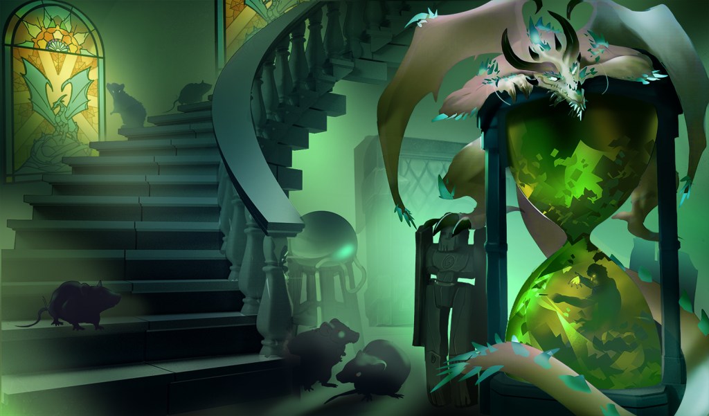
We decided on option 2 with some features from 1. I also requested Spellbook and a pack rat be added in the background.

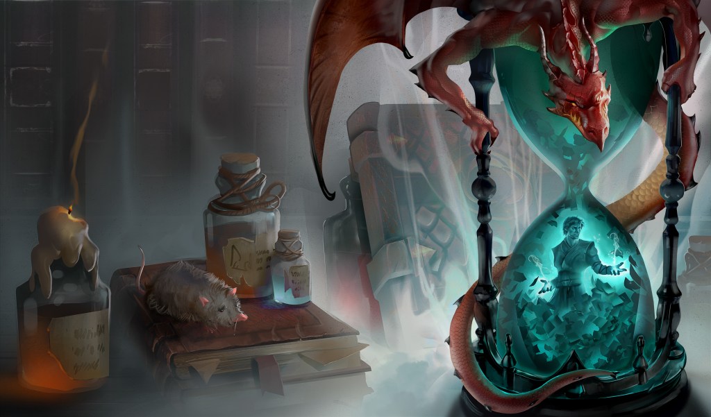
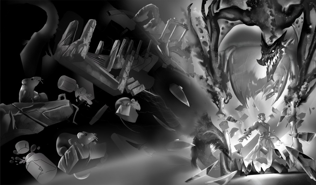
We okayed this version for coloring with a few minor tweaks and next up we got this.
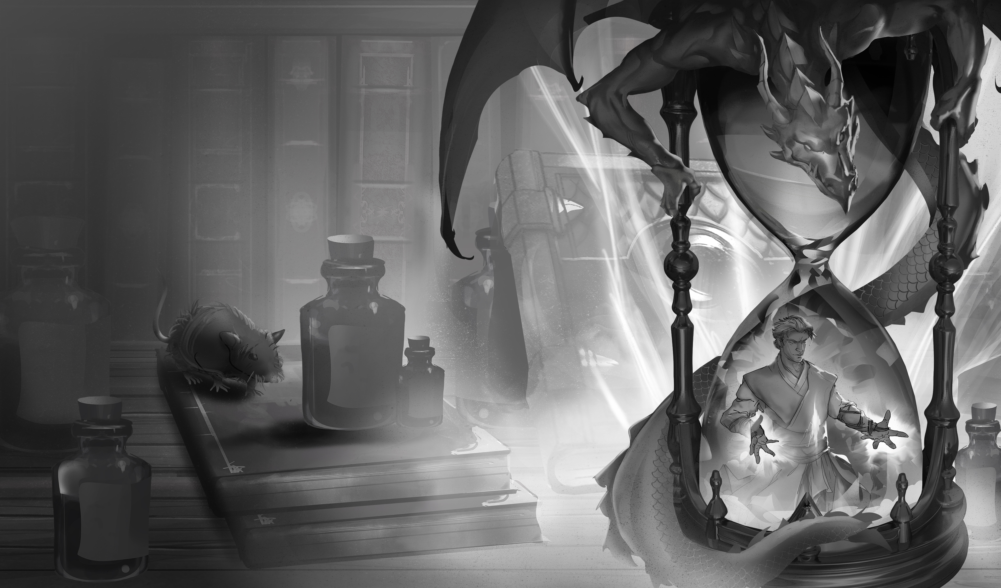
Then when more details were added, the MC looked weird all of a sudden.
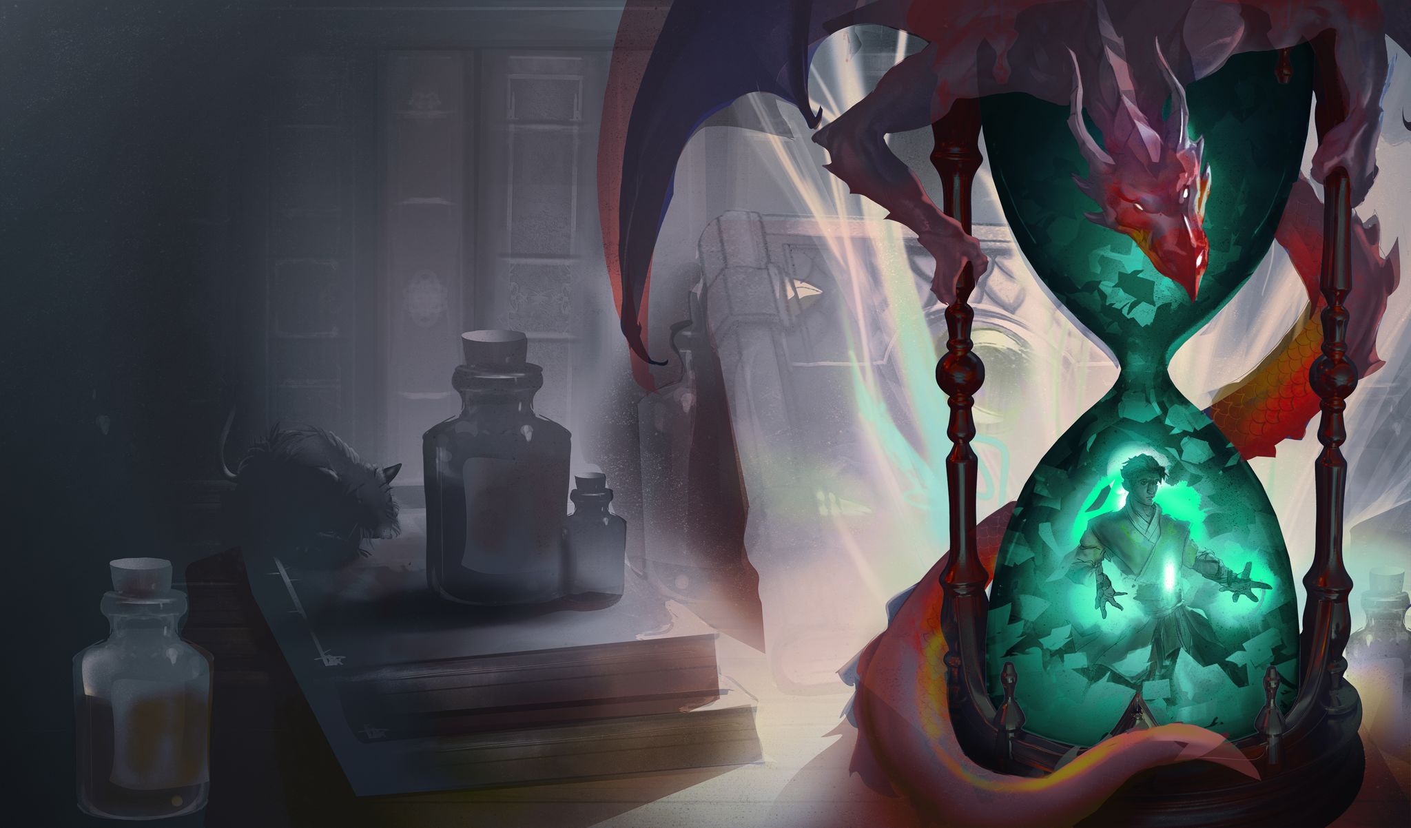
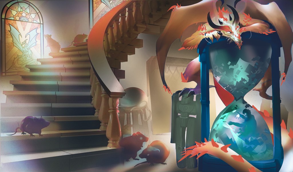
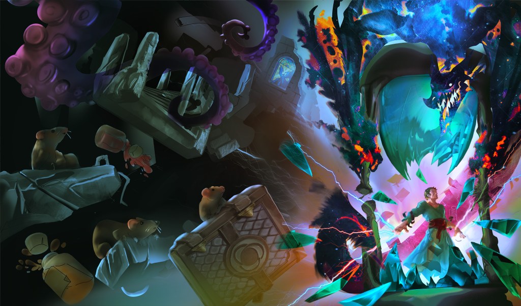
I sent some reference art and Lu came back with these A/B choices
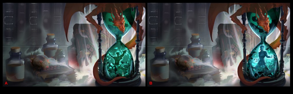
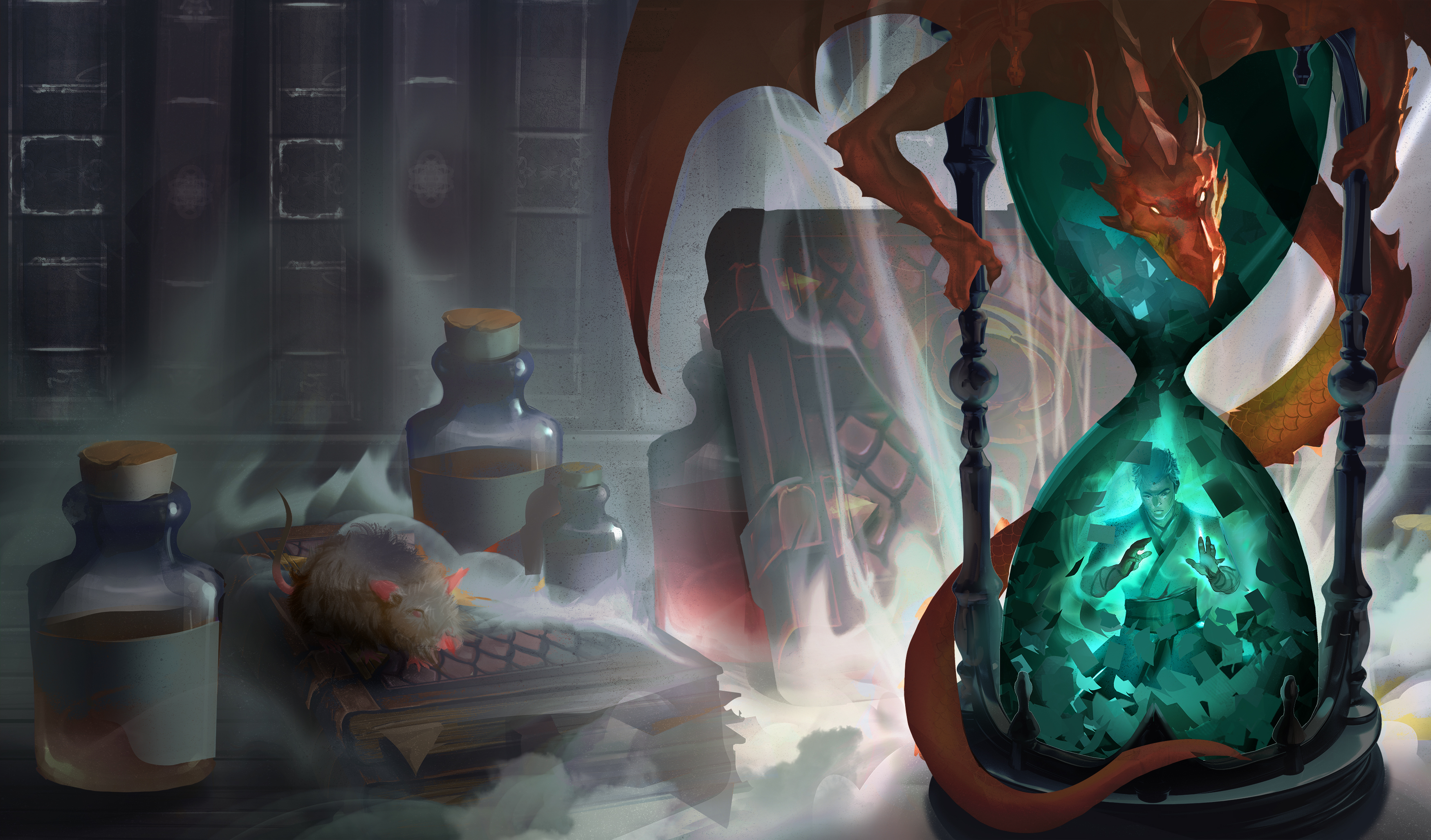
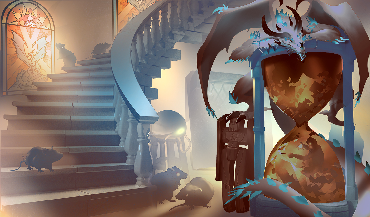
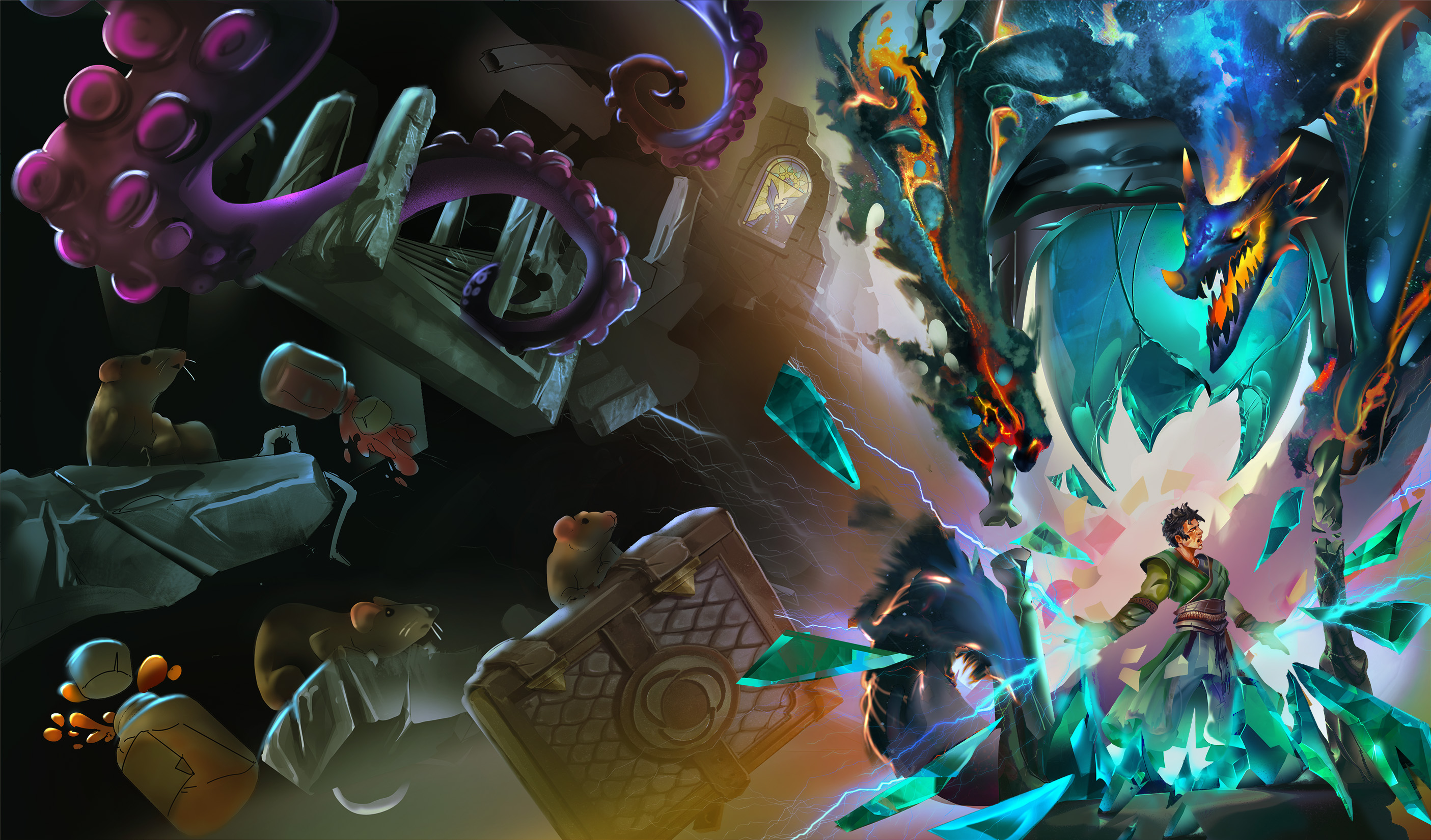
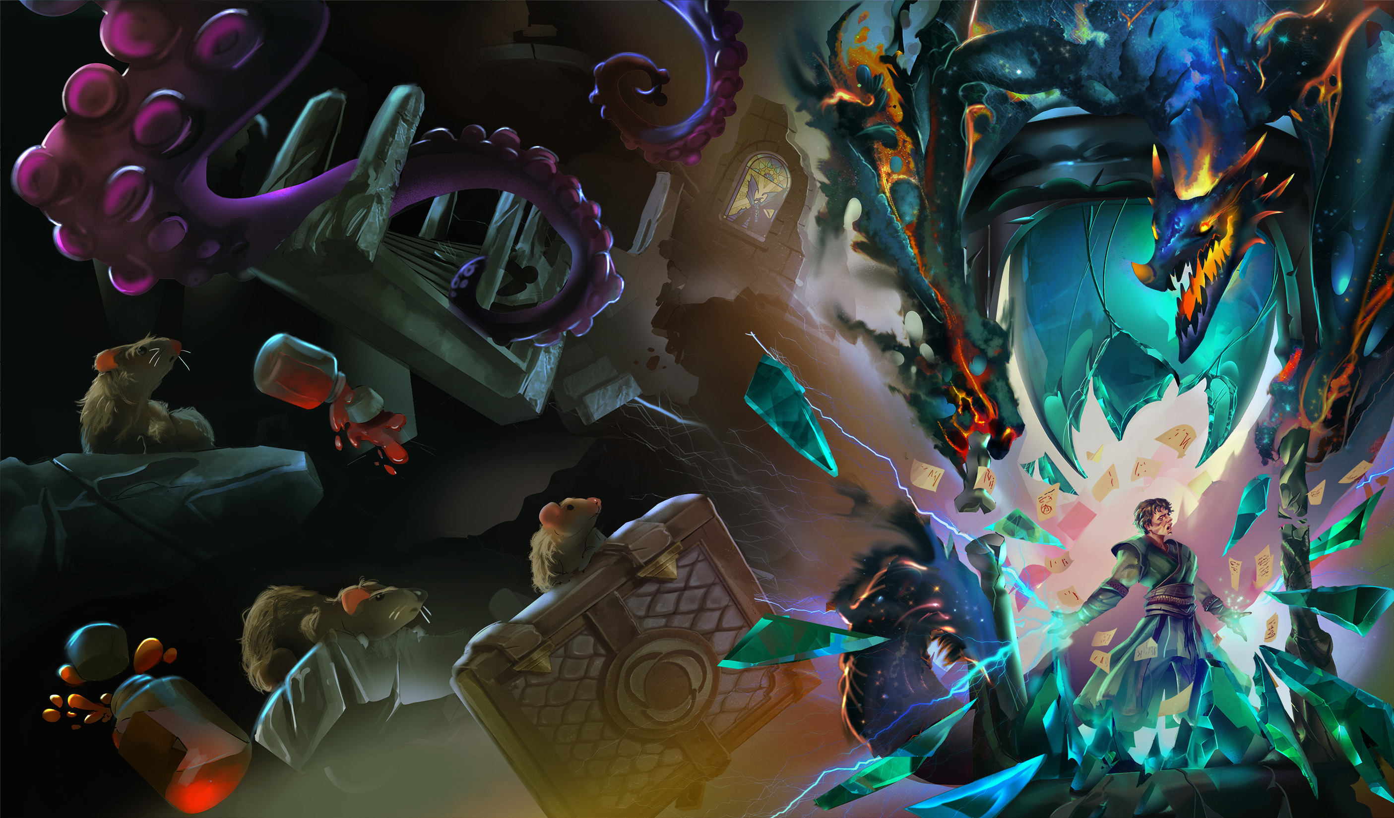
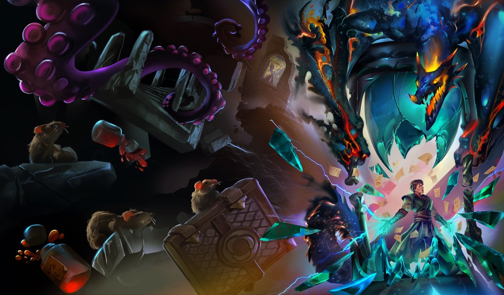
I still didn’t like these options for Tal, so after more back and forth we settled with the pose and got final cover.
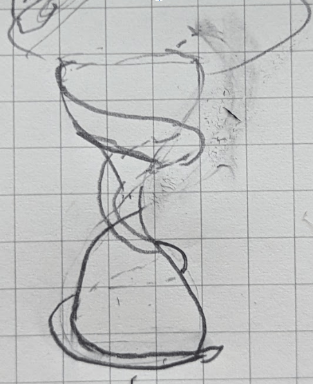
For my second book, things went much faster and I got these two drafts right off the bat. I had a clear idea of using a setting from the book as the basis for the cover with some not to scale elements in the background. I wanted a crystal dragon on a stone hourglass with two stone golems beside it. The first book started with Tal trapped in the hourglass, and the next book would have him begining to break out.
Here was my beautiful concept art. Don’t be fooled, I drew this myself, not the artist.


I picked option 2, asked for the background to be replaced with a wall and for the giant candle thing to be removed. I also provided more details on the golem appearance. I got the shaded copy and approved it for coloring.

Of the three color options, I picked the middle and then had a back and forth of details you can follow below. One point of feedback was that the dragon was looking more ‘icy’ than crystal.

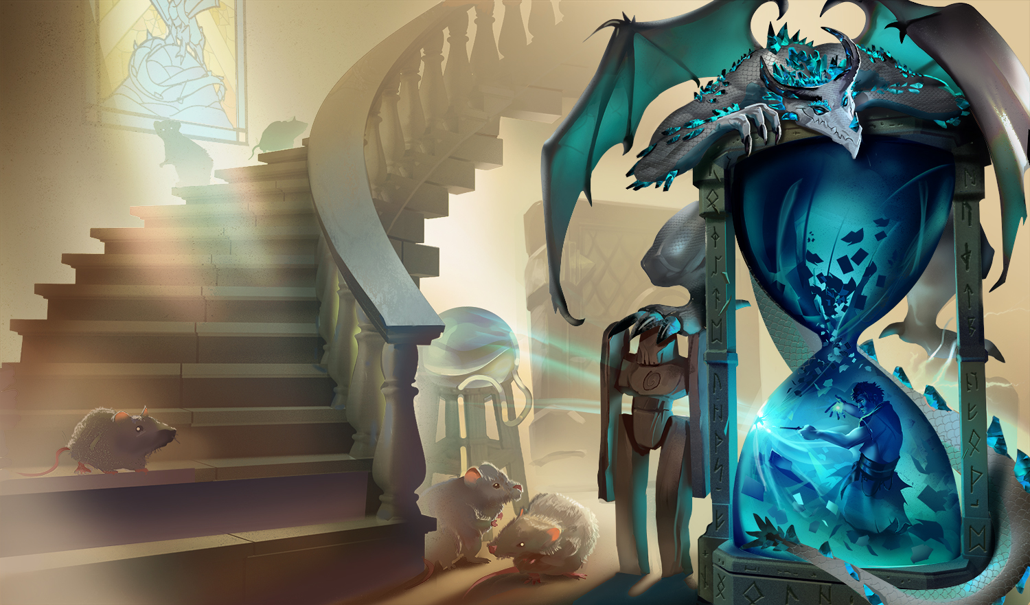
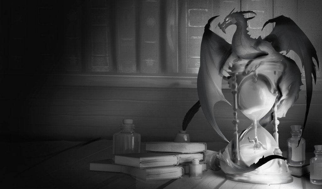
The final book 2 cover:

Book 3 went WAY faster. I had a very clear idea of what I wanted, but it was a bit out there and tough to describe. But, Lu did a greate job doing almost exactly what I wanted front the first draft. I wanted the remnants of an exploded building floating in a black void, then I wanted the dragon to look like its a portal into space.
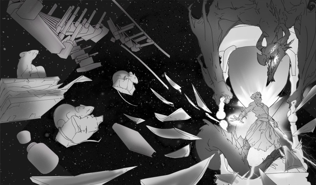

I pointed out some things I liked and got back the following more detailed sketches:
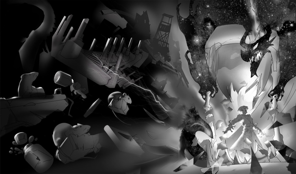
I picked the first option to go forward with and got:
I approved this for coloring with some tweak requests and got the next draft.
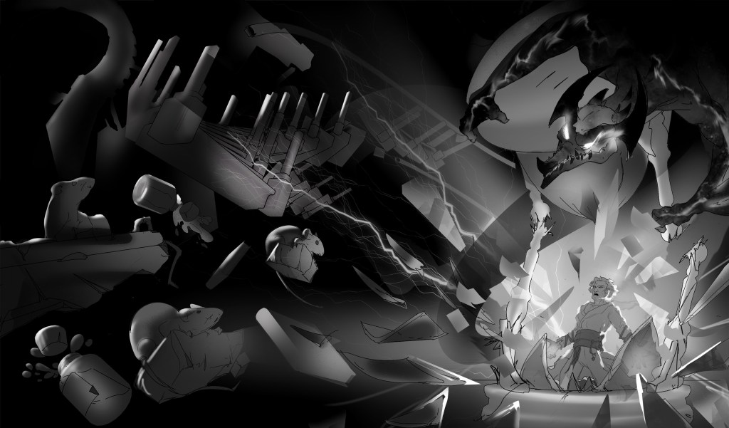
Pre-final rendering:
I got the left version, provided some feedback about the MC’s apperance.
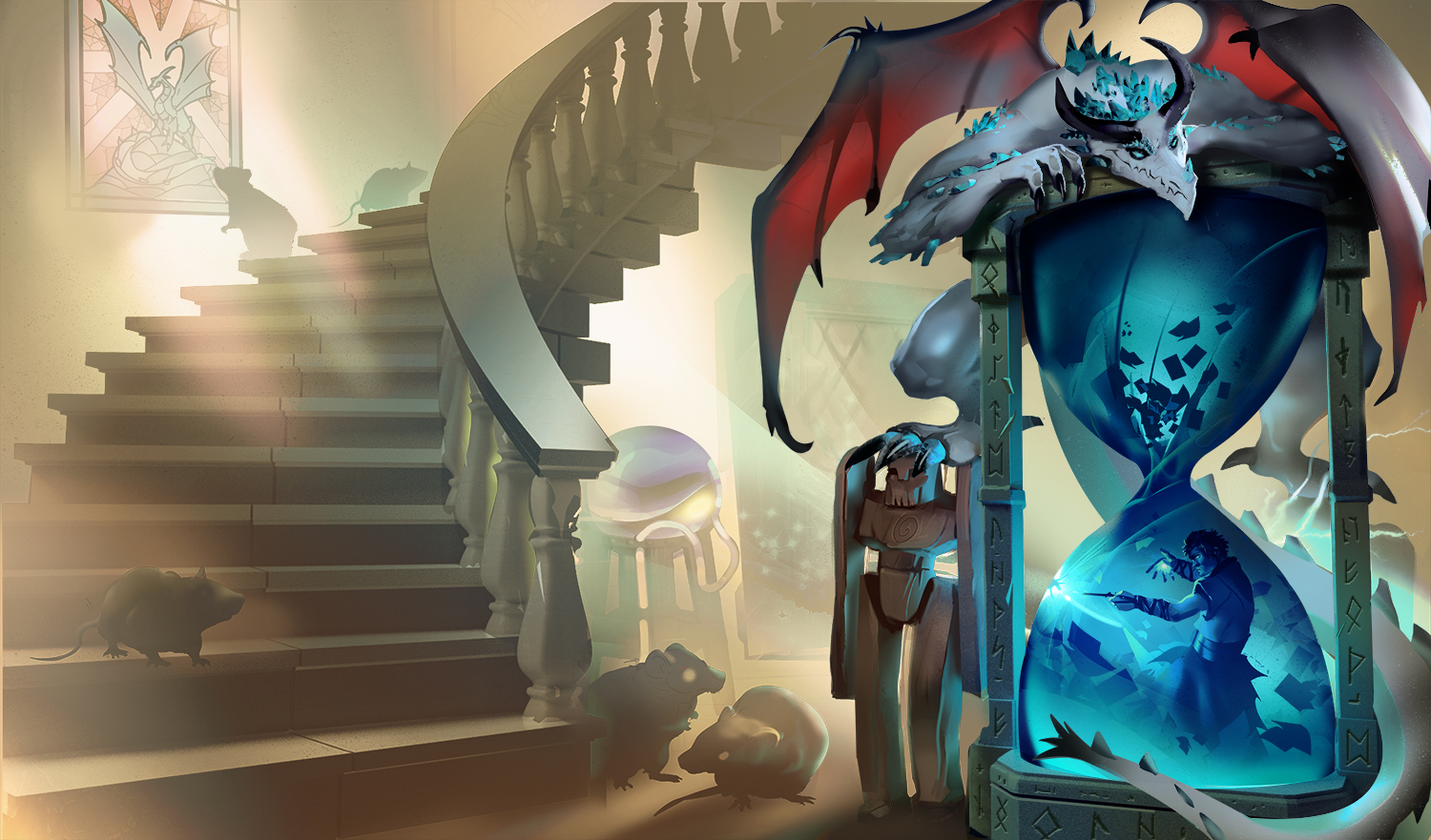
The final image:

Leave a comment